1952 – 1968
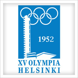
Helsinki 1952
A big leap forward from London’s effort. Using the colours of the Finnish flag, this contemporary logo incorporates the Olympic stadium tower as part of the design.
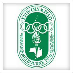
Melbourne / Stockholm 1956
Melbourne follow’s Helsinki’s logo with another monochrome, portrait design. Australian quarantine laws did not allow the entry of foreign horses, so equestrian events were held separately in Stockholm. The logo does not reflect Stockholm’s contribution, however.
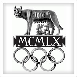
Rome 1960
Rome bucks the trend for welcoming, friendly logos with this monstrosity. According to the International Olympic Committee, it represents a “Roman she-wolf, from which Remus and Romulus are suckling. They are the twin brothers who, according to legend, founded the city of Rome”. It also has the distinction of being the only official Olympic logo not to feature the host city’s name.
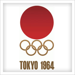
Tokyo 1964
Pretty self-explanatory, this one – the red disc represents the rising sun, just like the Japanese flag. Not much thought went into this.
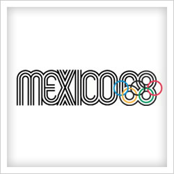
Mexico City 1968
The line patterns of Mexico’s 1968 games are influenced by the art of the Huichol Indians. A nice idea but in practice, this logo doesn’t work at all. The Olympic rings placed awkwardly over the numbers top off a forgettable Olympic logo.

Hey you don’t have Vancouver Canada 2010 games logo
http://www.vancouver2010.com