1972 – 1996
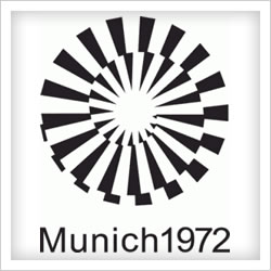
Munich 1972
Unfortunately, Munich 1972 will be remembered for something else entirely. Their logo contribution was different not just because of its interesting design, but because they did away with the Olympic rings altogether – something that hasn’t happened since.
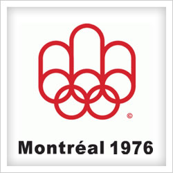
Montreal 1976
A podium and stylised letter Ms are linked with the Olympic rings to form the logo.

Moscow 1980
The star from the USSR flag sits atop a podium.

Los Angeles 1984
Stars and stripes from the flag of the United States are echoed in the LA Olympic logo of 1984.
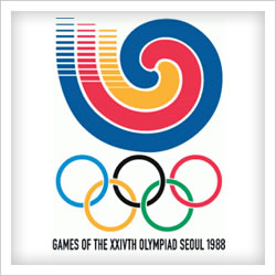
Seoul 1988
Seoul’s logo featured a traditional samtaeguk pattern, representing the world converging in Korea.
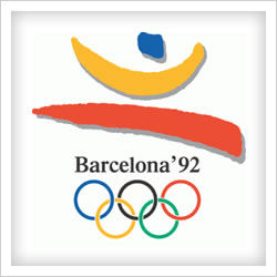
Barcelona 1992
A fairly colourful, inoffensive effort from Spain ruined with the use of what looks like Times New Roman font type.
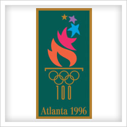
Atlanta 1996
The United States present one of the stronger Olympic logos of recent years here. Unfortunately, the hideous background and frame colour combination messes it up. Thankfully, the use of this official logo was limited throughout the 1996 games.

Hey you don’t have Vancouver Canada 2010 games logo
http://www.vancouver2010.com